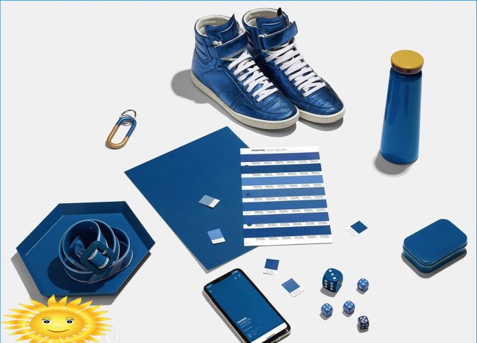
As always, at the end of the outgoing year, the Pantone Color Institute (American Color Institute) named the shade that will be the most relevant and fashionable next year. Our tips site is in a hurry to announce that PANTONE Classic Blue 19-4052 has been selected as the color of 2020, dubbed “the sky at dusk”.
Let us remind that the experts of the institute chose the “space” ultraviolet as the color of 2018, and the bright but soft “living coral” became the shade of the outgoing 2019, the portal told you about this. Shades of blue will now dominate, echoing the new color of the upcoming 2020.
As Leatrice Isseman, CEO of the Pantone Color Institute, noted, the deep, classic blue color is designed to remind of the endless sky, encourage broadening horizons, think deeper and look beyond the obvious..
The institute is confident that “the sky at dusk” symbolizes connection, confidence and tranquility, emphasizes the desire for stable and reliable support.
Practicing designers note that for the first time since the Pantone Color Institute announced the colors of the year, the institute’s decision has coincided with the innovations of many paint and varnish brands. That is, it will not be difficult to choose the “dusk sky” shade for your interior – this solution is offered by many manufacturers, the color is not rare or too complicated.
Pantone Color Institute gives advice not only to interior designers, but also to advertising specialists, fashion designers. Therefore, shades of blue twilight sky will appear in 2020 not only in interiors, but also on packaging of goods, in fashionable clothing collections..
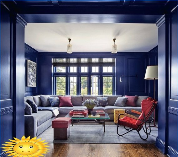
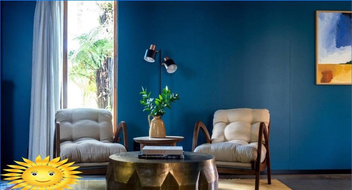
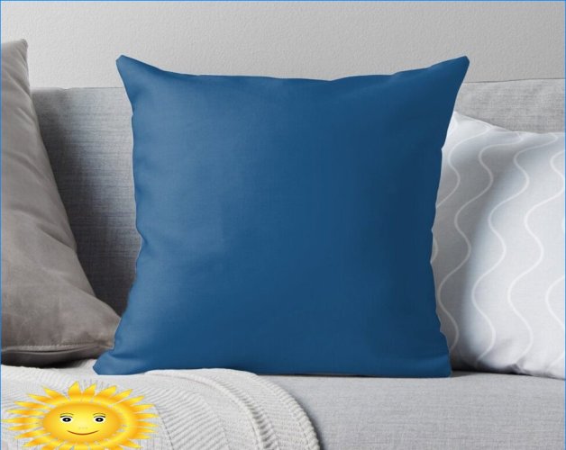
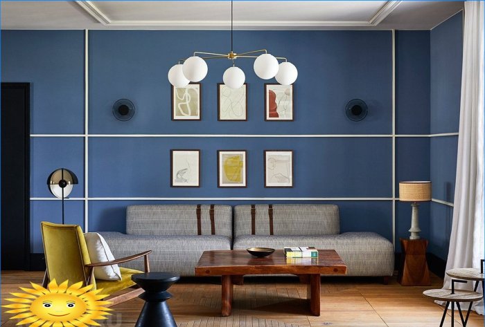
PANTONE Classic Blue in the interior goes well with gray, preferably a light tone. In addition, deep blue will look great against a background of neutral beige, sand, mustard colors. Also PANTONE Classic Blue goes well with light yellow, pale blue, lilac, pale red. The classic is the combination of blue and white – a win-win choice.
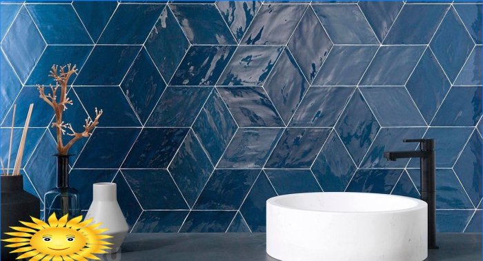
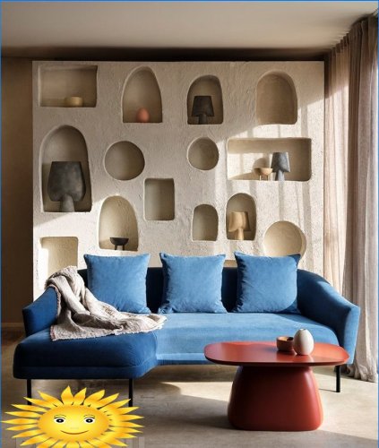
There are many options, the designers are sure that the “sky at dusk” will look great both as a background and as an accent color. This shade can be used to paint the entire wall or use it as a point, making a neutral interior more vivid..
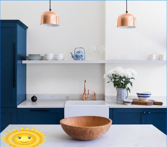
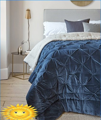
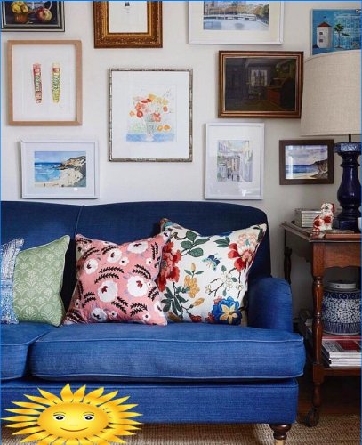
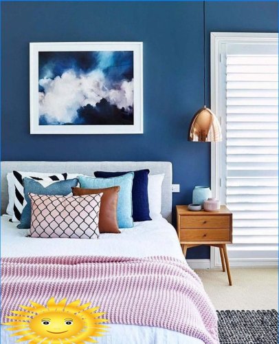
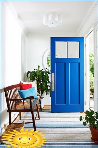
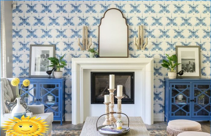
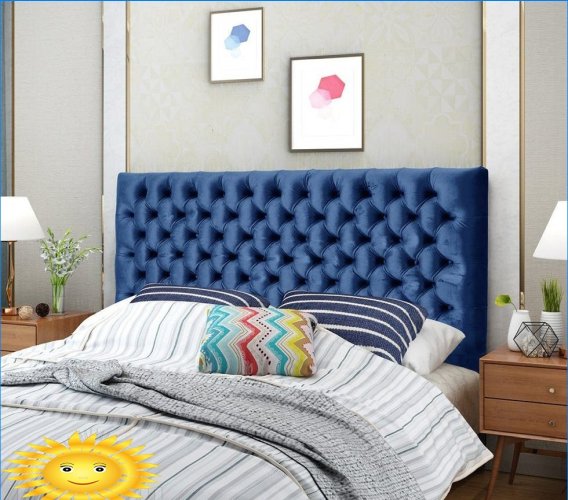
Designers urge not to be afraid of blue in the interior. Don’t want to make it a background – use it as an accent. For example, you can buy a blue bedspread, paint a chest of drawers or a door into it. Sofas of a deep blue hue look very interesting, and blue-white kitchens look especially fresh and non-trivial..
What criteria does the Pantone Color Institute use to determine the color of the year? Is it more based on current trends, symbolism, or a combination of both?